By Bob Kraemer
Formula. Format. Familiarity. The retail recipe is tried and true, based on brand dress and standards developed over years and, often, decades. Standards meticulously define everything from the logo to the physical layout of stores. Storefronts, where the visual expression of the brand identity is most evident and most essential, is especially prescriptive. A Barnes & Noble in Miami looks the same as a Barnes & Noble in Minneapolis.
Also for decades, retail store consistency has been harnessed in lock-step with retail center consistency. One space is much the same as the next — a different wrapper on the same standard set of boxes. But as people move back into redeveloped and revitalized urban centers at a higher rate, retailers are refocusing where they will set up shop, moving into Main Street or downtown spaces with different spatial and aesthetic profiles.
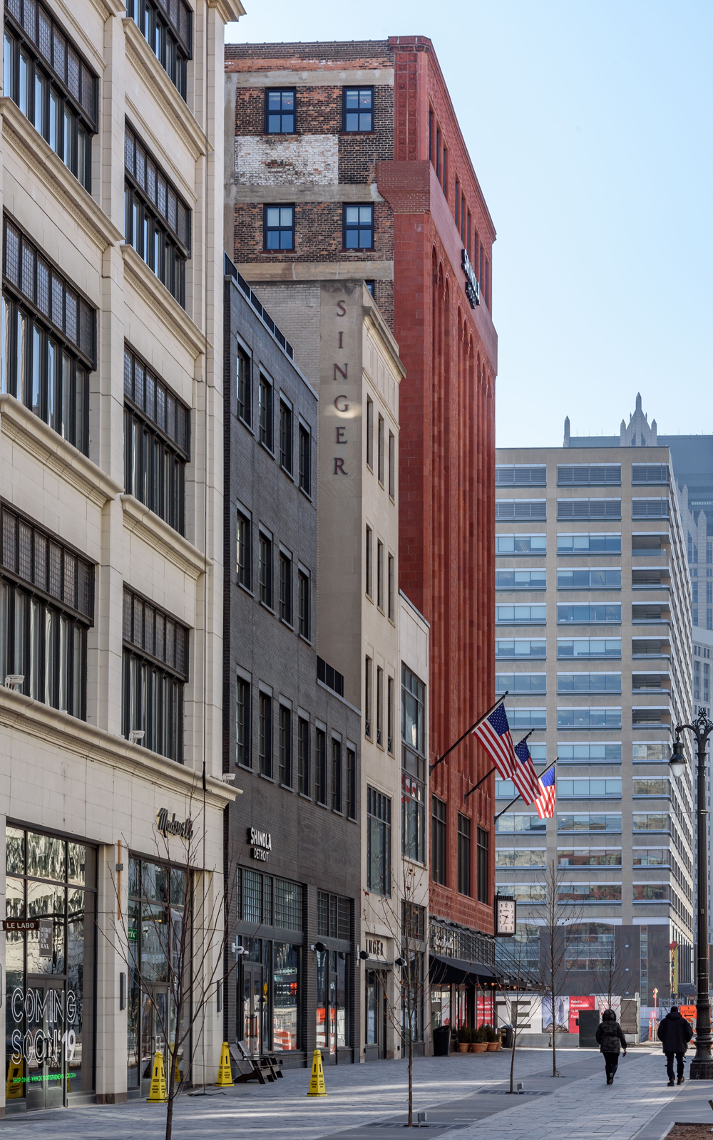
For instance, the dimensions of urban retail spaces are almost invariably deeper. In Detroit along Woodward Avenue, stores are 100 feet deep. This is an artifact of a time when stores needed plentiful storage space for inventory. Advances in inventory management and just-in-time distribution have made extended square footage an unnecessary expense, and needs today are much different.
Historic buildings, too, can be encumbered by regulatory limitations that can be a deal-breaker for some retailers. It can be difficult to conform to an existing space complete with elements that must be preserved or an unfamiliar set of dimensions that requires brand standards to change drastically. The good news is that retailers are showing more flexibility and more willingness to look at new urban Main Street opportunities, even if it means reevaluating long-held brand standards that define a storefront.
Capitalizing on those opportunities often requires developing a new or modified brand standard, a process that can be surprisingly complex.
Every brand has several key elements or brand hallmarks. The nuanced and often important interactions between those different elements aren’t always obvious until one or more of them doesn’t fit into a space, and the result is a space that is operationally or aesthetically compromised. Most brand standards are intricate and elaborate concepts evolved over a long period of time. Discarding them piecemeal is unwise.
Modified brand standards need to retain those iconic elements that ensure the essence of the brand is preserved. It’s not just about aesthetics. Brand standards are part psychology, part graphic design, and part structural and operational pragmatism.
Members of the Millennial generation are especially likely to bypass familiar stores in favor of unique, historic looking “special” retail spaces. As its new downtown Detroit location demonstrates, brands like Under Armour are embracing history and modifying their brand standards to make that happen. Other brands are even taking those changes a step further. Williams-Sonoma is adding home furnishings to its line of product offerings to help create a concept that fits in larger spaces. We are almost certain to see more creativity going forward, with more dual-branded stores and concepts integrated into new and different pieces.
Bob Kraemer is a co-founder and principal of the Detroit-based Kraemer Design Group. He can be reached at bob@thekraemeredge.com.
This article originally appeared in Chain Store Age.
